Freelance Design Work
When I moved to Germany my visa stipulated that I must work as a freelancer. This restriction gave me the wonderful opportunity to work with a wide variety of clients and projects. Below you’ll find a selection of some of my favorite work.
Grey Paris
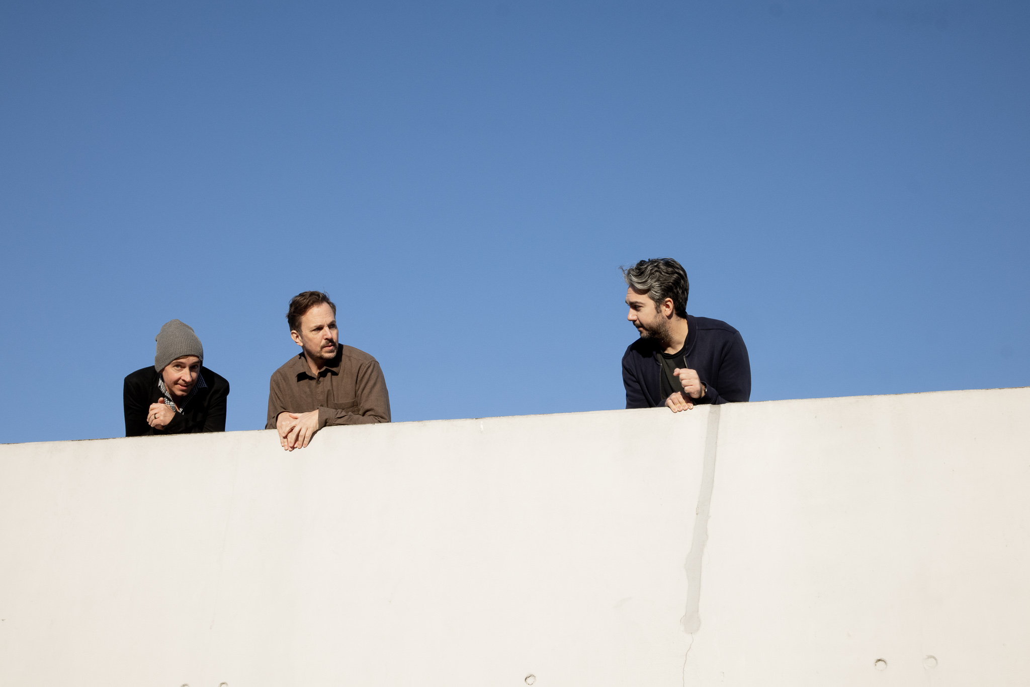
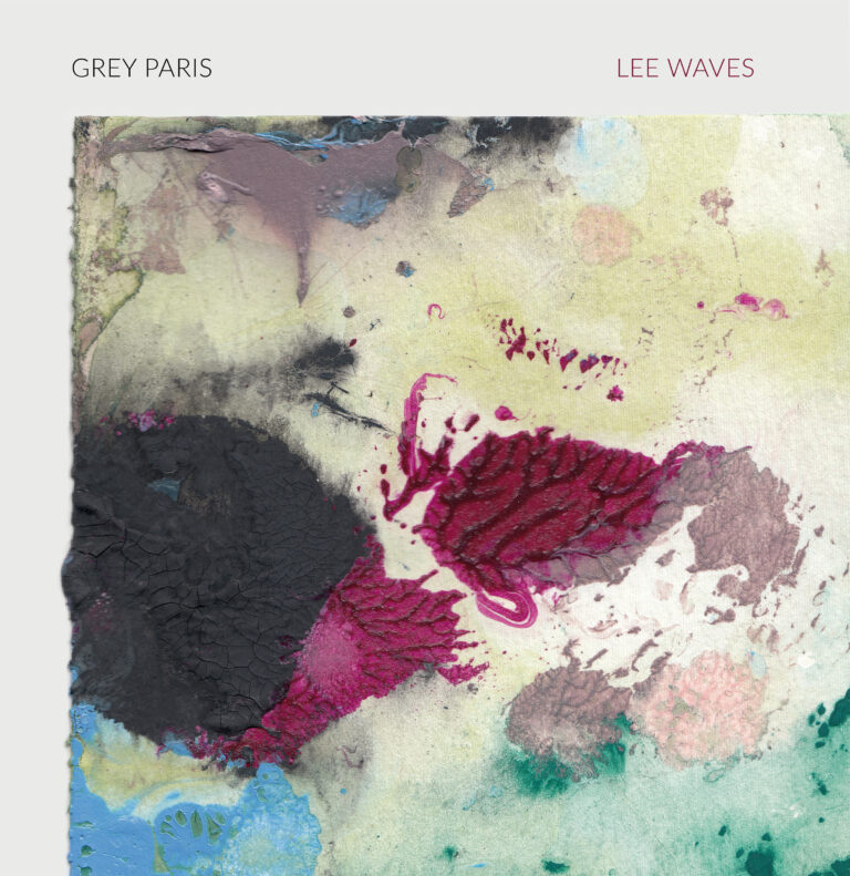
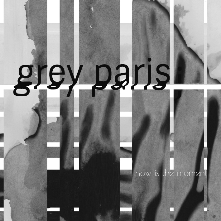
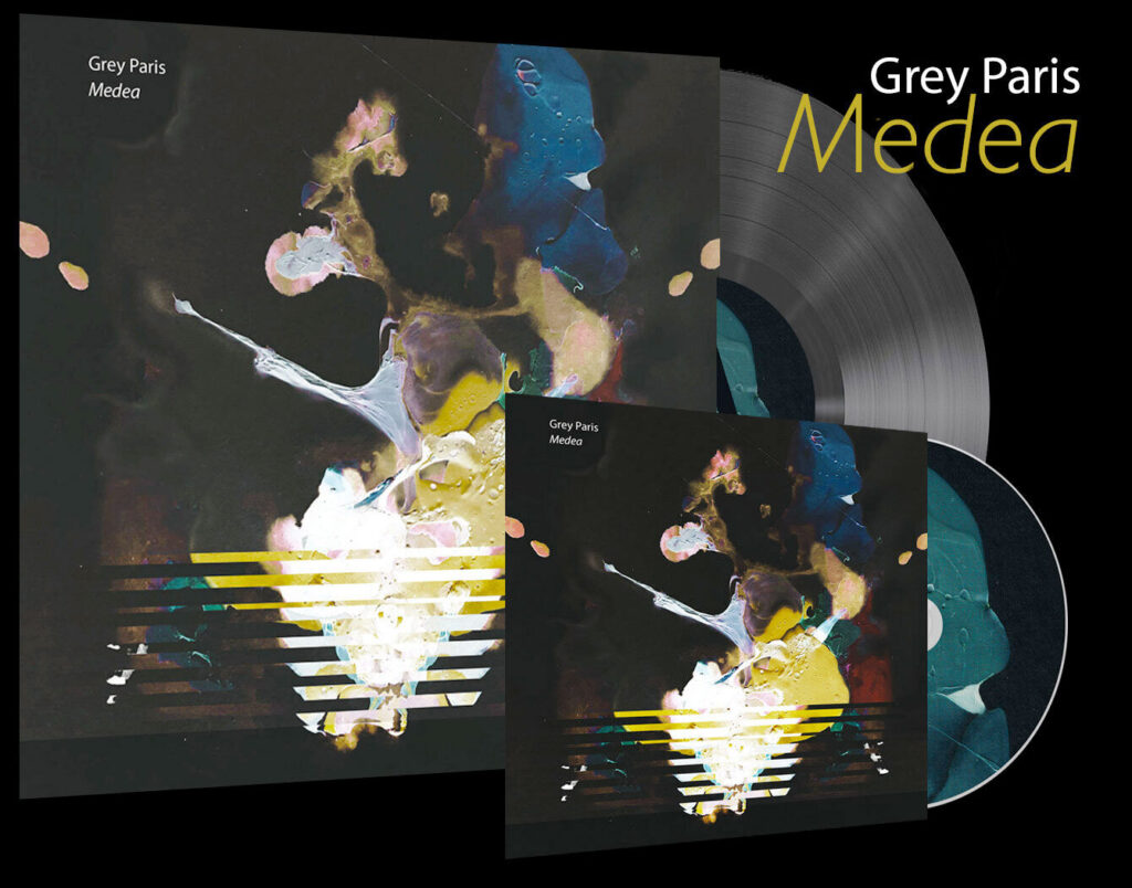
Grey Paris is a Berlin-based self-described Electronic-Acoustic, Cinematic Jazz Trio managed by the Label SpringStoff. Collaborating with the trio from their early days meant that we started from the ground up, designing a logo, brand image and artwork for their first and second EP as well as their Debut album MEDEA.
As their go-to designer, I’ve had the privilege to join them backstage, at rehearsals and on the road to shoot behind-the-scenes content for their socials and press kit.



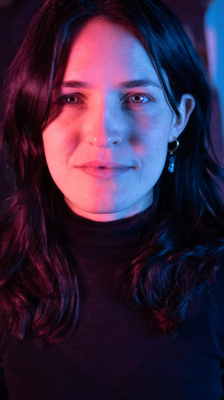
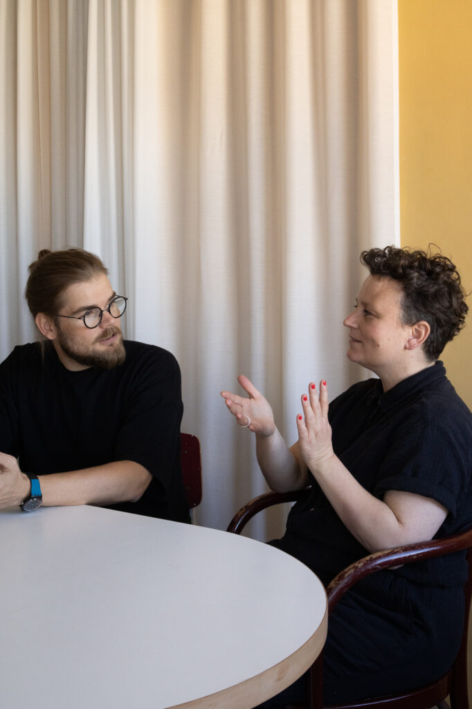
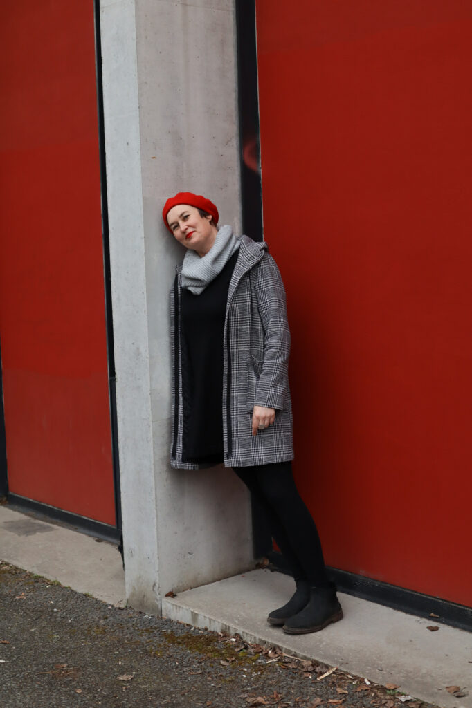
Portrait Photography
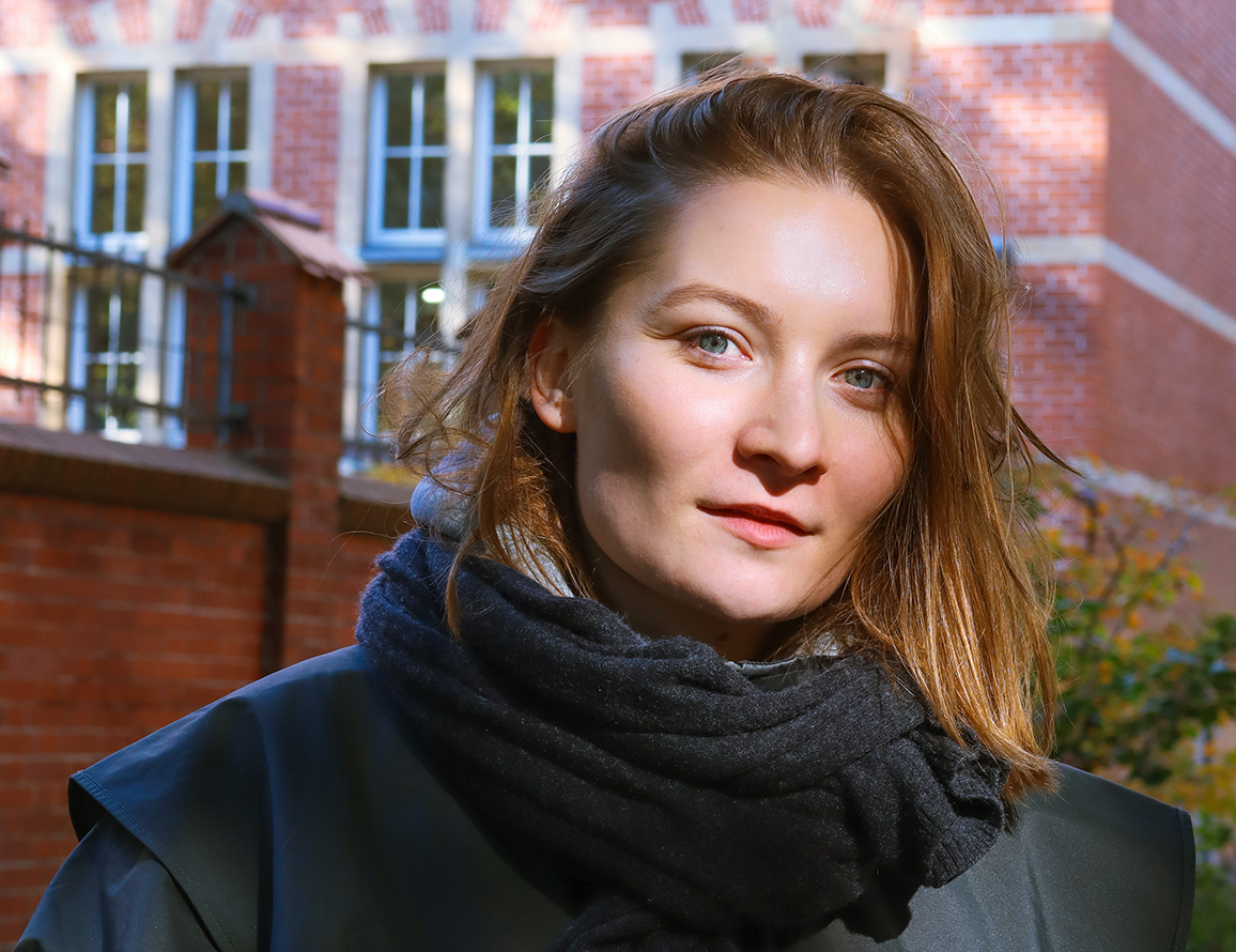
Portrait photography is one of my favourite forms of photography. Getting to know my subjects from behind the camera, putting them at ease and taking a shot that even the pickiest subject approves of brings me deep satisfaction.



Making Stories
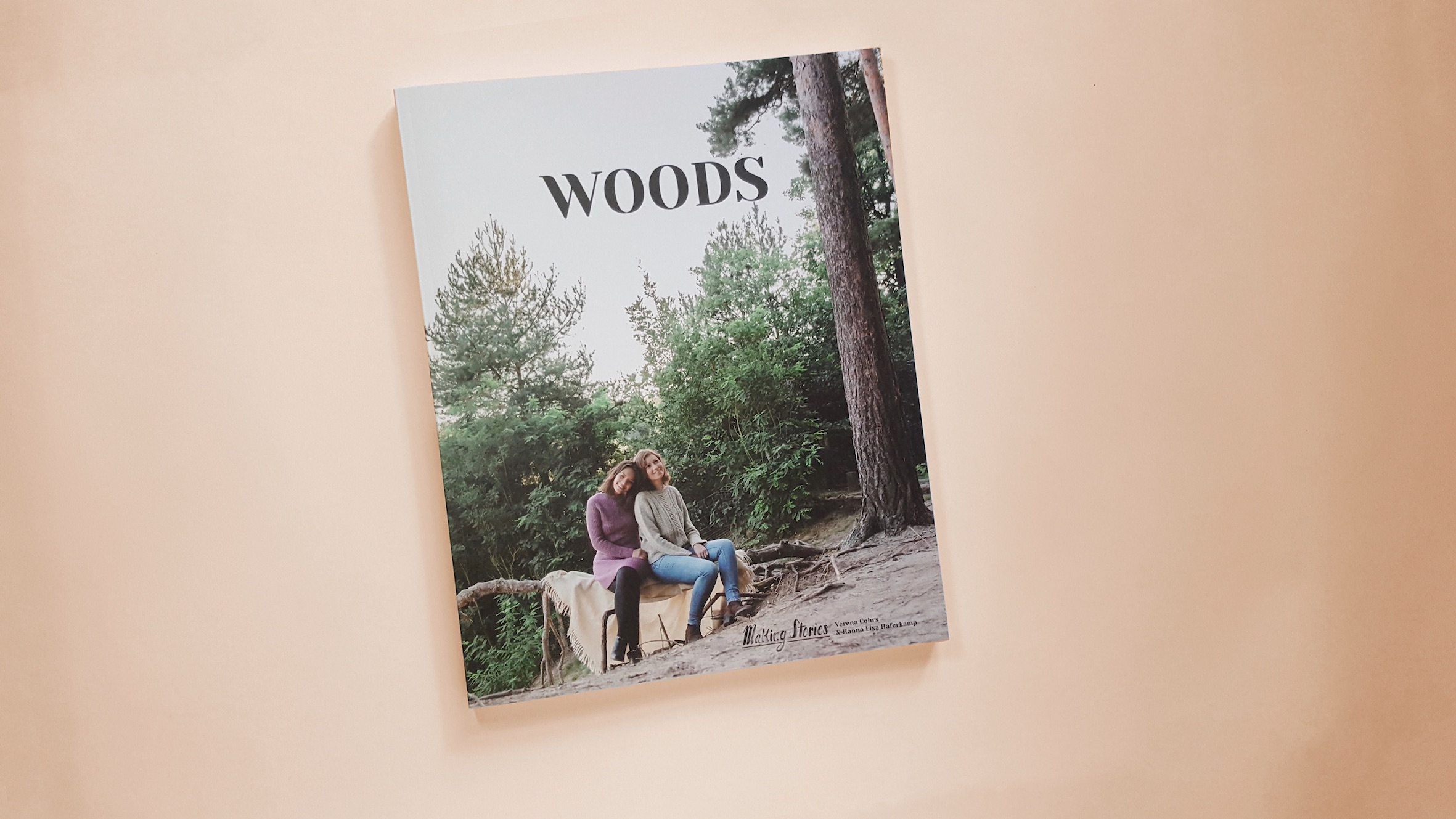
Making Stories is an indie knitwear design and publishing company, and one of my earliest print design collaborations. The founders requested that I design not only their first print magazine but also their brand.
With several rounds of feedback, we achieved a logo that is both uniquely theirs, flexible and familiar in a comforting way.
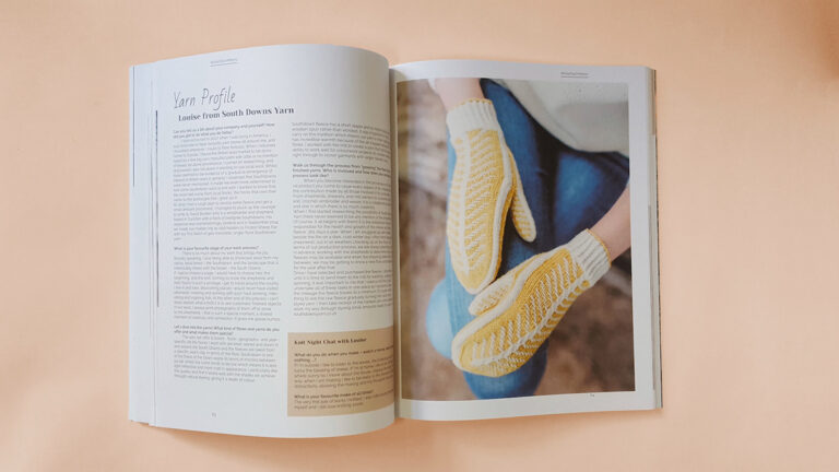
The 75-spread book was a year-long project, focused on editorial design, publishing, printing at scale (5,000 copies and counting). As the only designer on the team, I was responsible for every visual decision for the book.
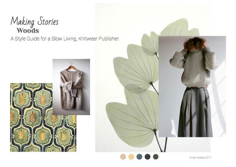
The layouts reflect their modern and minimalist sensibility, with a cozy sweetness that resonates with their online community of knitters.
The book is on shelves in more than 30 stores across the globe.



HELL
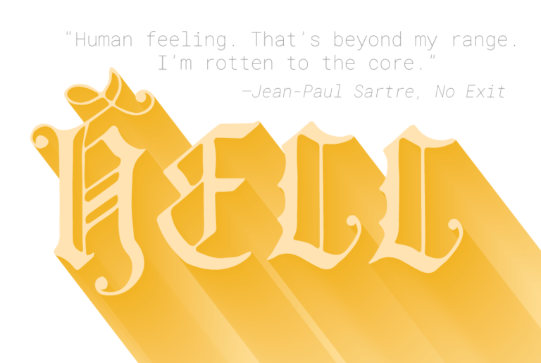
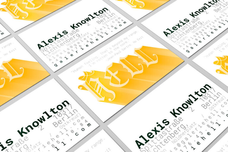
Galerie HELL is an art space in Berlin-Lichtenberg that opened in fall of 2018. Gallery owner Alexis Knowlton came to me with clear aesthetic ideas and reference points she wanted to include. Through deep conversation, we developed a brand for the space which embraces the duality of the Gallery’s name and a snarky feminist attitude as a nod to the international female artists whose work is presented there.
The Gallery’s name HELL represents both the German word for light and the English word for eternal damnation and darkness. The name is a play between two cultures and can be both light-hearted and cynical. Hell is never ending, it bears resemblance to yin and yang and can be represented by polarizing contrasts, light and shadow, black and white, soft and hard, polished and gritty.
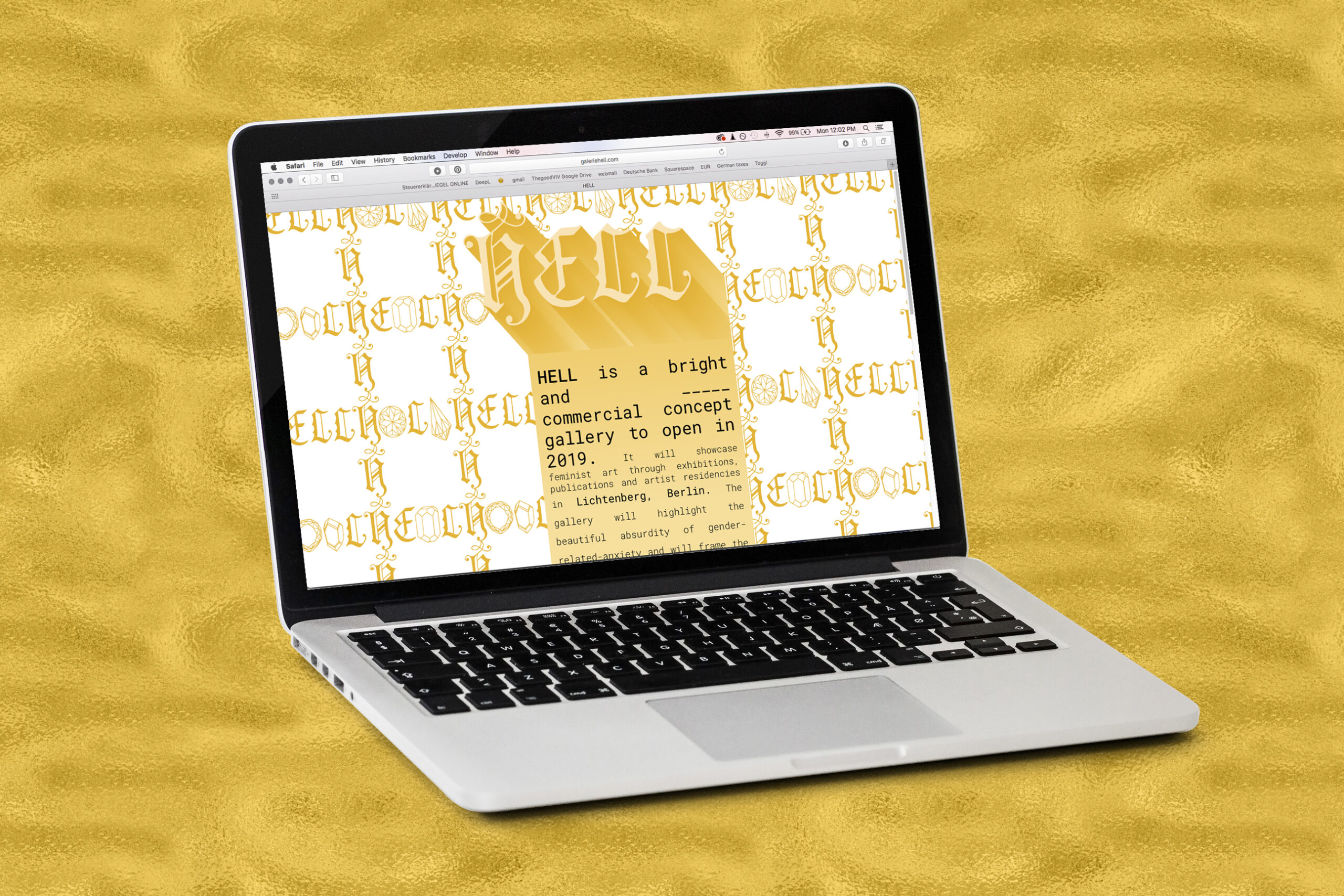
Alexis asked me to take risks with the splash page and later the website and make it unforgettable. Combining gold glitter texture, gradients, patterns and undulating line spacing the website is both daring and an art piece in itself.
Do check it out, it’s wild: www.galerieHELL.com
